Archive for the ‘apps’ Category
French Open app
The website pattern for tennis slams events seems pretty stable with the Wimbledon strawberries being the only major addition I can remember recently.


The apps on the other hand evolve quite dramatically for each slam. As the slams happen every January, May, June  and September they can be an interesting model for an app business that refreshes itself on a predictable and quite rapid cycle.
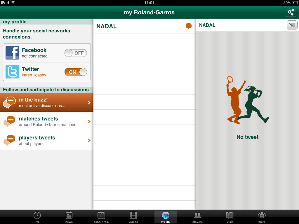
Last year’s US Open iPad app seem liked a significant move forward with a main social screen but Twitter and Facebook interaction have been resolutely buried again in this year’s French Open app. There is a social area but nothing ever seemed to load there.
Instead of the social screen the default view is an aerial of the ground with a scattering of scoreboards for matches going on. I imagine this could be a helpful first view but it rarely seemed to be  up-to-date when I launched the app.  The space dedicated the viewing the main match was a waste for me (and most users?) as live video was only available to Orange mobile customers in France.

The whole app is slow and often takes an age to actually load today’s scores. Frequently I would sit puzzling at screens before I realised they were a day out of date or sometimes just labelled with the wrong day.

The app prompted me to set my favourite players as soon as I installed the app but never seemed to do anything with the information. I presume it is only used for notifications if anything (and I had them switched off).
The draw seemed to be either very oddly conceived or just never loaded. I’m not sure which.

To it’s credit the app was much more upfront that play had been suspended but this was the only bright spot for me.

I wanted to try the Android version too but it wasn’t available for the Nexus 7.
Disappointingly it seems this slam’s app is too slow to be usable, a bit buggy  and a backwards step in many ways with no real innovations to compensate. Wimbledon can’t do worse that this. Can they?
prototyping with iOS Storyboarding in Xcode
I was happy to read How To Prototype In Xcode Using Storyboard. It is good to see a resource on using Xcode Storyboarding from a designer’s perspective as I think it has huge potential if you are doing a lot of prototyping for iOS devices. I made a prototype of a Guardian Film app last year using Xcode. It took a couple of days but that included learning my way around Xcode and when it was done we could load it onto an iPhone for user testing because it was an iphone app (if not exactly something you would launch).

We didn’t go on to develop the test into a full product but it would have been interesting to see whether it was worth the developers building on the Storyboard app or if they’d have needed/wanted to start again from scratch.
I had a load of notes that I was intending to turn into more detailed instructions but as I haven’t gone back to Storyboard since this is all I have…
Note: compatible with iOS 5+ only.
Storyboard is effectively a flowmap, but one that actually generates an app. You can add dummy/fake content or if you can handle a bit of code (or know someone who does) you can pull in the real content.
Workspace components
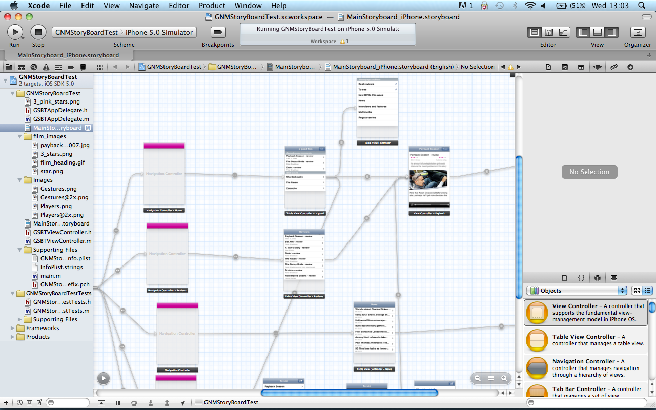
The canvas
This shows the flowmap or storyboard in the central pane of the workspace (also called standard editor?). You select mainstoryboard from the project navigator to open the storyboard editor if it isn’t showing (I have  managed to get stuck with another editor open and be unable to switch back to the standard/storyboard editor).
There’s an arrow in a circle that collapses part of (the standard) editor that shows the app as a (file hierarchy?) rather than a flowmap. If you can’t access an element on the canvas (say it is ‘below the fold’) then you can edit it via the ‘hierarchy pane’. You may also need to rearrange elements in the ‘hierarchy pane’ if you need an element visible in the canvas so you can create a segue.
Navigators (on the left)
- project navigator (cmd +1) shows the file structure of your workspace
- symbol navigator (cmd + 2)
- search navigator (cmd + 3)
- issue navigator (cmd + 4 )
- debug navigator (cmd + 5)
- breakpoint navigator (cmd + 6)
- log navigator (cmd + 7)
You can change navigator display using the icons at the top of the navigator, or the edit menu or the keyboard shortcuts shown above (cmd + 0 to remove all navigators).
Libraries(bottom right)
- file template library
- code snippet library
- object library – drag the controls from here onto the canvas
- media library
Inspectors (right, above the object library)
View these for an object by selecting the relevant object on the canvas.
- file
- quick help
- identity  – use to change class of object
- attributes – lots of controls of the content/layout etc of each object
- size – mainly controls the relative positioning of the object
- connections
Components of a storyboard
Scene
A scene is a screenful of content or view. (Synonymous with view controller?)
cmd+ click to move as a group
Segue
A segue is a transition between view controllers.
Segue types:
- push: “pushes the destination view controller onto a navigation controller’s stackâ€
- modal “ presents the destination view controllerâ€
- custom “design your own transitionâ€
You ctrl+drag to create a segue (/relationship?) between scenes. You’ll be asked to pick transition type but you can change this later in the attribute inspector if you select the segue.
There’s also ‘relationships’ between container and child containers but are these segues or  something different? I don’t entirely understand segues versus relationship.
- modal segue completely obscures screen below, slides up temporarily
- nav controller pushes one view on top of the other = segue
- can’t use segue for cancel/done buttons (need delegate?) “no such thing as a reverse segueâ€
- automatically get back navigation when using some controllers but not others. Use push segues between parent and child in a hierarchy to maintain the navigation and tool bar
Note: You can only edit the elements of a scene when viewing in 100%, although you can create segues between scenes at any zoom.
Controllers
- container view controllers display content owned by other view controllers. Each type of container defines its own interface to manage its children
- content view controllers present content on the screen using a view or a group of views
- shows data
- collects data
- performs a task
- navigate between a set of available commands
Types of controllers:
- view controller: the fundamental view-management model.
- split view controller
- reference library controller
- table view controller
- navigation controller (subclasses available from the Identity inspector). Manages the navigation bar and the button to navigate back
- Image picker controller
- Video editor controller
- tab bar controller
- page view controller
To get a split view or ref library controller, add a view controller then go to the Identity inspector and change the class. Same process applies for turning a nav controller into an image picker or video editor.
The initial view controller is a setting that determines which scene is the start scene when you launch the app. Select a controller, view attributes and tick “is initial view controllerâ€. I think this automatically un-ticks this for whichever controller was previously the intial view controller.
Objects
Note: check the properties of a generic object if you can’t see the specific one you want. You can often change the sub-type.
Types of objects available:
- label
- round rect button – can be turned into a variety of buttons
- segmented control
- text field (creates a text field that the end-user can edit – use label for uneditable content?)
- slider
- switch
- activity indicator view
- progress view
- page control
- stepper
- table view
- table view cell – has a number of variations you can choose in attributes
- image view
- text view
- web view
- map view
- scroll view
- date picker
- picker view
- Ad BannerView
- View
- Navigation bar – has attributes that control colour and style
- Navigation item – can be turned into a variety of buttons
- Search Bar
- Search bar and search display controller
- toolbar
- bar button item – can be turned into a variety of items
- fixed space bar button item
- flexible space bar button item
- tab bar
- tab bar item – can be turned into a variety of items
That’s as far as my notes go. If I do another project with Storyboard then I’ll add to this.
navigating the world of tennis broadcasting rights
The world of tennis broadcasting is a complicated one and one that has led me to some odd device behaviour.
In the UK Wimbledon is free to air on BBC, as is Queens and the ATP (mens) tour final. French Open is now on ITV (presumably as part of a bid for Wimbledon). With the Australian Open the BBC tends to broadcast a men’s semi and the two finals live. Eurosport showed matches but no Andy Murray ones.
The last US Open was only on paid for TV (primarily Sky with some early matches and/or delayed coverage on Eurosport). Sky also shows some ATP tournaments but not the WTA (womens) ones even when they are joint events. Eurosport used to show lots of WTA tournaments but seems to have reduced that.
Many of the tournament websites stream free to air in their own territories but very few tournaments are in the UK.
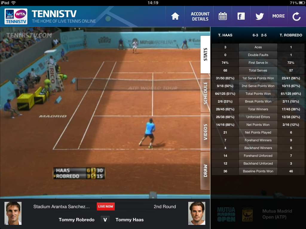
Which leaves TennisTV who show most ATP and WTA tournaments but not the big grand slams. Quite a few tournaments aren’t available if you are in their home territory (so this time being in the UK works in my favour).
So the solution seems to be TennisTV for the tour. BBC for Wimbledon, Queens and the ATP final. ITV for the French Open. And a combination of Sky, BBC and/or Eurosport for US and Australian Opens.
So far, so complicated.
Now add in pricing. I don’t have (or want) satellite or cable TV so I’m looking at online or app subscriptions. (I’m using all the apps on my iPad 2. I’ve considered the Android alternatives but the equivalent apps are either not available for the Nexus 7 or the reviews are so terrible about performance and customer support I wouldn’t risk paying for the apps)
Eurosport player
Subscribe online to Eurosport Player and the prices are £4.99/month or £2.99/month for a minimum of 12 months. You can subscribe via the iPad app £2.99 for a month, no minimum.

SkyGo
I only want Sky’s tennis coverage for a single fortnight a year. This is possible with SkyGo in spite of their best efforts to conceal the option (well, it’s possible to subscribe for a single month anyway).

On the SkyGo page the information about how to get Sky Go without Sky TV in your home is a long way down the page after many suggestions that you need to be a subscriber. And it’s a closed section that you need to expand to read it. Then you can get a monthly SkyGo pass for £35/month that includes Sky sports channels. You can’t subscribe via the app itself. It would be £42.50/month to subscribe to the equivalent TV service and that would be for a minimum of 12 months.
Still £35 it is a lot more than I’m paying for other tournaments so come US Open time I’ll be checking what Eurosport and the BBC are providing very carefully (and how much time I’d actually have for watching) before actually paying for this.
Tennis TV
Tennis TV online is £14.99 a month or £84.95 a year but if you subscribe via the iPad app it is £6.99 for a month, 17.49 for 3 months or £57.99 for 12 months. And you can easily switch off auto-renewal.
Apple’s constraints around subscription prices and renewals work in my favour with both Eurosport and Tennis TV and encourage some odd screen behaviour. I don’t want to subscribe all year round to these channels, just when they are showing tournaments I’m interested in watching (and have the time to waste) so being able to cancel at will is perfect. And the app prices are a better reflection of what the content is worth to me. But buying an app-only sub means watching on my iPad even when sat at the computer and technically being able to watch on desktop. And at times that has resulted in a slightly warped second screening behaviour:

short thumbs and phone navigation
In an early version of the BBC’s iPhone 5 launch story the main image was captioned “Apple said the larger screen could still be easily operated with one hand”.
I read that and thought, still?
Last year I spent some time using the Guardian’s iPhone app and wondered why I found it so awkward to navigate when the Android app I was used to is basically the same thing just with some Android tweaks. The awkwardness came from needing to press the back button in the top left. I couldn’t reach it with my thumb.

I couldn’t reach the top left on the HTC Desire I was using either but it didn’t matter because you navigate back using the hardware back button at the bottom of the phone. Ben Lang on Carrypad points out that the (old) iPhone dimensions are generally better for one-handed use as the squarer proportions give the thumb more range, but it’s specifically the iOS design pattern of back top left that thwarts me. Other stuff appears in the top left on Android apps but not things i need for every other interaction.
Ben makes a similar complaint about the Android interface but I don’t find the notifications to be core interactions and centre-top isn’t as hard to reach left-top.
“Both the buttons… and the status bar, are always persistent, no matter where you are in the OS. You have to constantly use the Android buttons to navigate through apps and the home screen, and you have to pull the status bar down with your thumb to access any notification that comes through to the device. The core functionality of the device involves reaching your thumb from even further below the bottom of the screen to hit the buttons, then all the way to the very top of the screen to pull the notifications menu down.”
I guess on the larger screen sizes that Ben is concerned about even centre-top becomes a difficult reach. But top-left is a problem for me even on the 3:2 ratio iPhones.
Now I know I’m generally a smaller scale human being but I didn’t think my hands were exceptionally dinky. Hand anthropometry data confirmed my thumb is on the small size but not freakishly so.
Apart from Ben’s article I only came across one other piece on how (small) hand size might affect touch screen design. There seems to be more out there about larger fingers and the challenges they have with typing and target areas.
Interface Design for Single-Handed Use of Small Devices by Amy Karlson doesn’t go into huge depth about button positioning and thumb reach but she does mention:
“Additionally, thumb movement along the (top left – bottom right) diagonal direction was slower than for the other directions, suggesting a biomechanical constraint for that type of movement.”
So it appears that if my thumb and I want to use my phone single handed then I’ll have to stay away from iPhones. Given the trend with Android and Windows seems to be bigger and more rectangular, I may be increasingly out of luck there too. Â Can we have a small phone backlash please? And no important stuff top-left ok?
US Open tennis app
The US Open iPad app is one of the better attempts at a tennis app. That may sound like faint praise but it isn’t a sport that regularly covers itself with app glory.
The start screen just shows you the most regularly useful content, rather than trying to present even handed journeys to everywhere. You can see what’s happening at a glance and  swipe across to see a number of key courts. They’re also making heavy use of multiple Twitter feeds, broken down by court which makes each stream a bit easier to handle.

The app doesn’t have the serving information from the website. Including that would help give more of a sense of what’s actually happening for those using the app as replacement coverage. Also noticeably missing (esp for the US Open) is any notification when there is a rain delay.  I’ve repeatedly thought the app had stalled when actually play has been suspended. Not sure why ‘In Progress’ didn’t just get swapped for ‘Suspended’. Maybe it did on the wireframes.
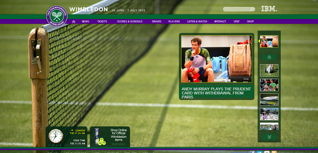
I was also impressed with the display of the draw, especially after the failures of the Wimbledon digital experience on that score. Wimbledon managed to fit the same depth of the draw on their (scary) website as they had in their phone app. They achieved this by putting the content in frames and going a bit overkill on navigation. Quite a (un)impressive feat.


The same thing happens with US Open website and mobile app (also from IBM), although the website is not quite as bad as no frame is used and you can scroll to use more of the screen real estate.
But the iPad app is dramatically different and is able to show an entire quarter of the draw for five rounds (and the ad gets more prominence here too). If you tap on the match it brings up the score, something that the interface doesn’t really convey.

The only problem I had with this was that they’ve deviated from the conventional left to right for the full draw and instead arrange each quarter into a quarter of the screen. You can see this if you zoom out but I was initially confused when I scrolled to the bottom of the page looking for the second half of the draw. Scrolling from left to right when you are in the middle of this page is a bit of a wobbly experience.

Oddly the Slam Tracker data that IBM make such a big deal about is really buried. The only way to get to it is to go into the Live score pages and tap on the match. Again the interface doesn’t suggest the match is tappable. And it doesn’t work from the homescreen. I only discovered it because I read elsewhere that the app included Slam Tracker and went hunting for it.
It’ll be interesting to see what IBM do with this for the Australian Open in January. Although I probably won’t make much use of it, with most matches happening while I’m asleep or pre morning coffee consumption.